Eddy for Whatcom
THE BRIEF
Develop an exciting, fresh visual identity for a grassroots Whatcom County Council campaign.
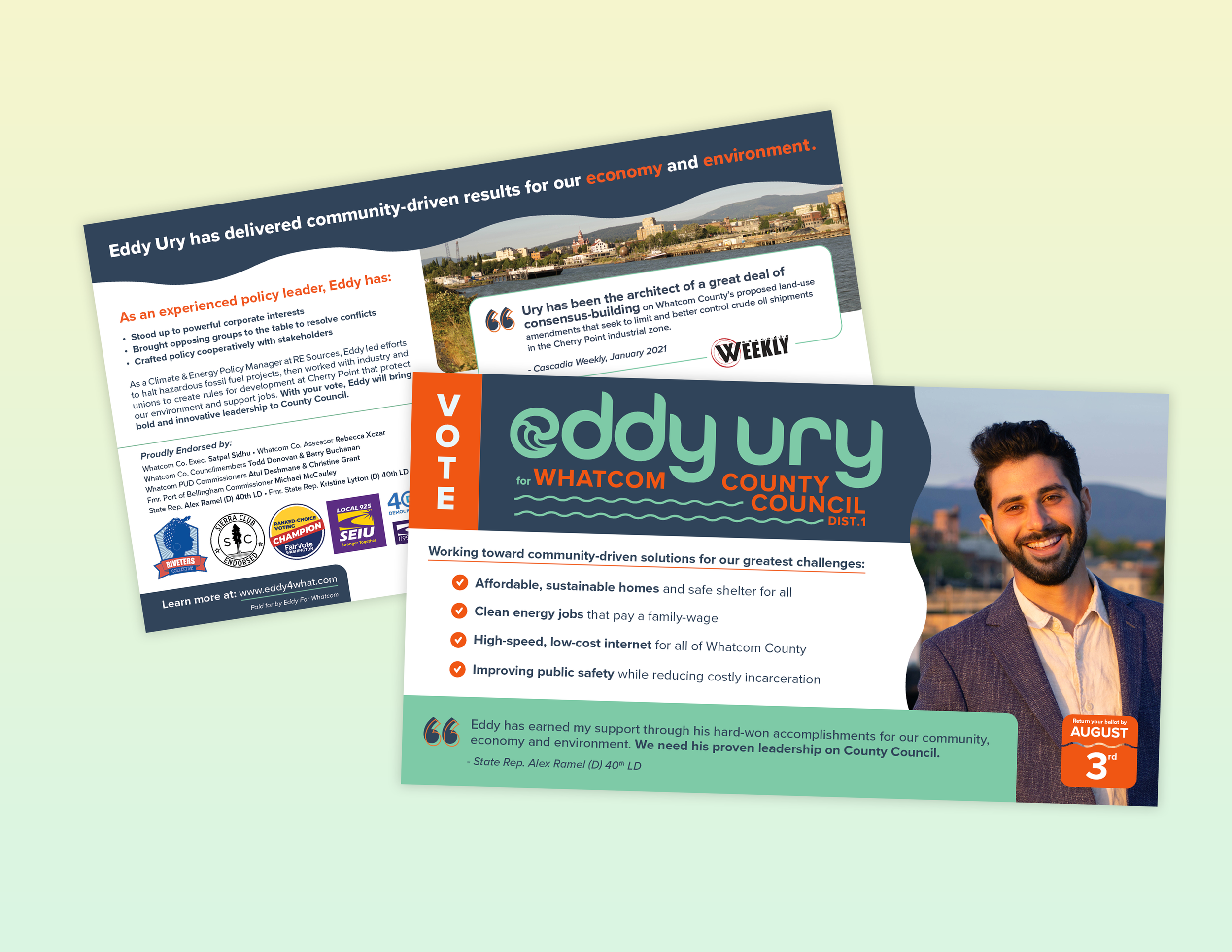
FUN FACT: I photographed all of Eddy’s headshots. Like all good aspiring public-servants, he hated being photographed. I got him to smile anyway.
Process
CLIENT KEY WORDS: Dynamic, Kinetic, Waves, Change, Modern
I had no shortage of inspiration from creative, left-leaning campaign brands to draw from. I am particularly obsessed with Tandem NYC and their work on AOC’s campaign.

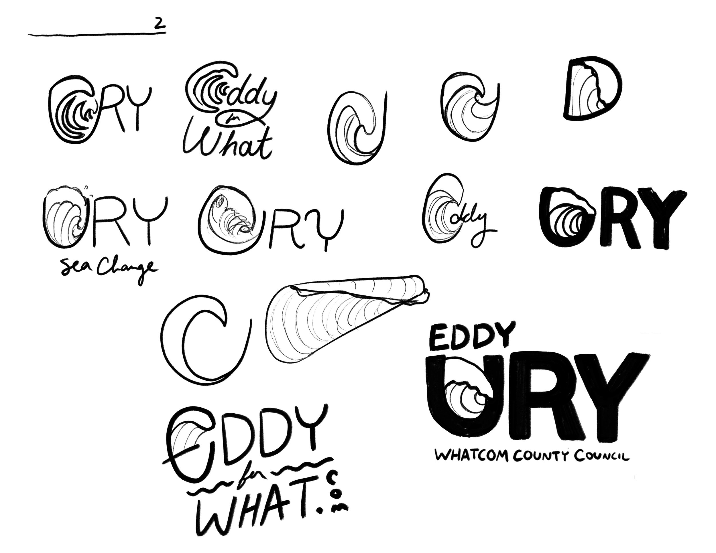


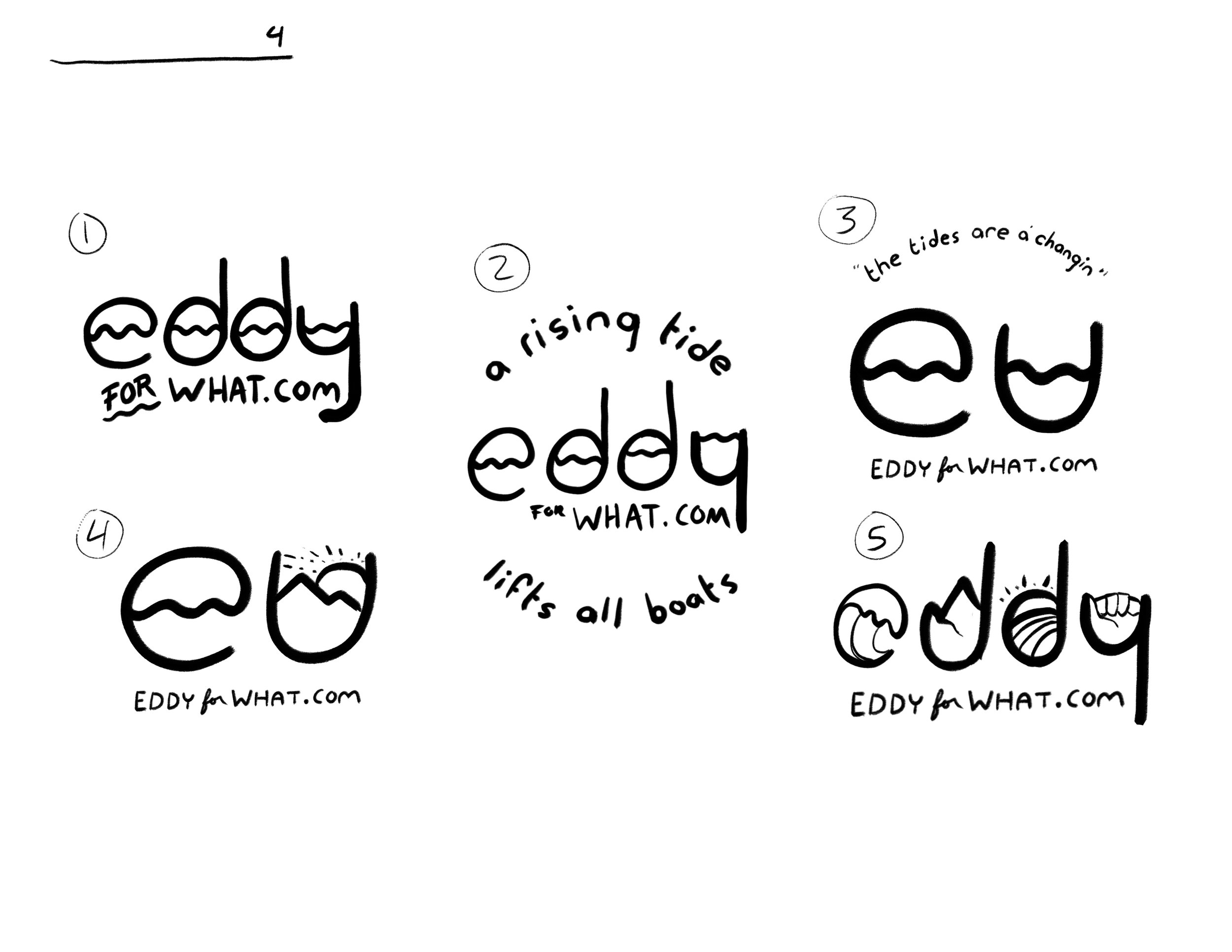
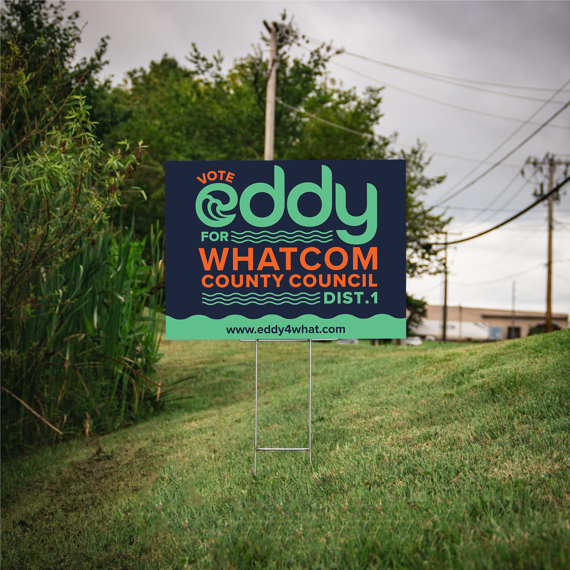
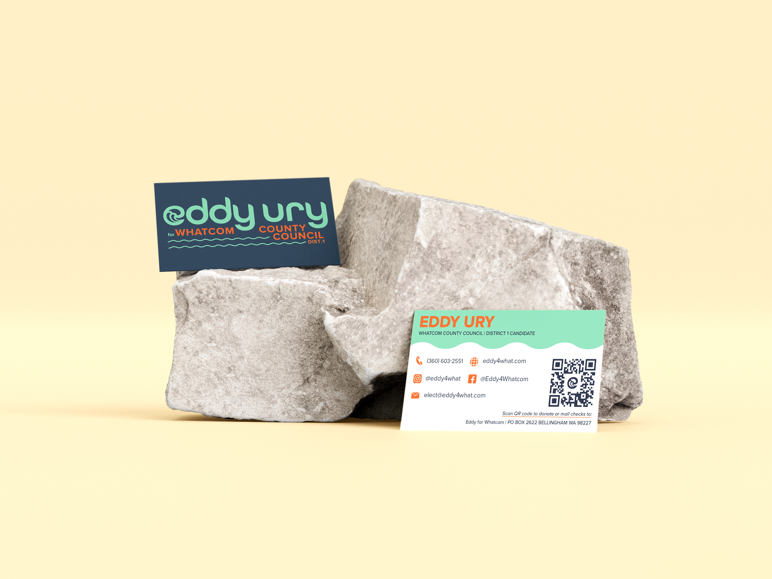
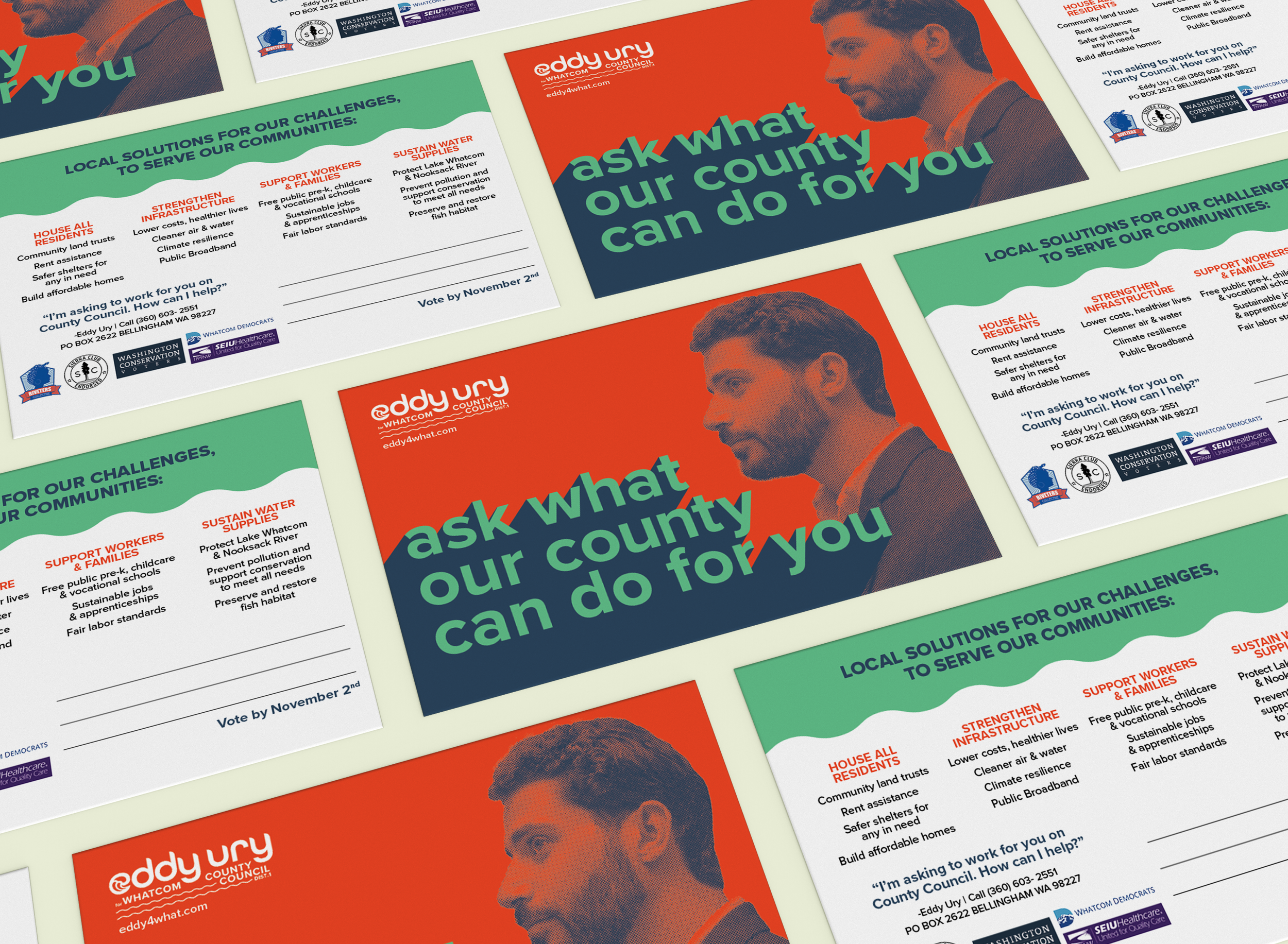
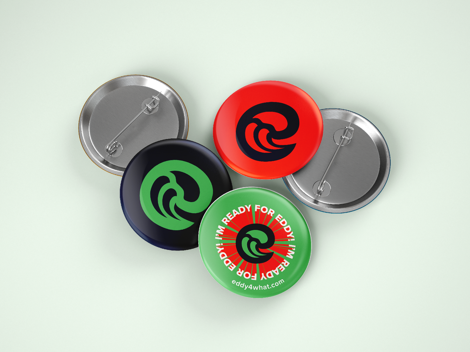
The Logo System
Eddy was a fan of Bauhaus design, which made selecting a typeface and style a no-brainer. I manipulated type from the Proxima Nova family to achieve our wavy text.

I developed three versions of the logo that could fluctuate with campaign funding and communications needs.
Banner — for headings on print materials and the website, and more formal settings
Shorthand — for signs and more casual settings
Logomark — for small print on merchendise, profile pictures, and the website favicon