THE BRIEF
Rebrand Fences for Fido to better align with their growth and success as an established, successful nonprofit.
GOALS
Refresh the brand while staying true to its friendly spirit
Clarify the mission statement through the visual identity
Adapt website for modern audiences

Logo Development
CLIENT KEY WORDS: Friendly, Approachable, Free
I started with, well, what else? Dogs. Different breeds have so many interesting shapes that could become logo elements. From there I experimented with different letterforms for the triple-f and fence iconography before trying to combine all three.

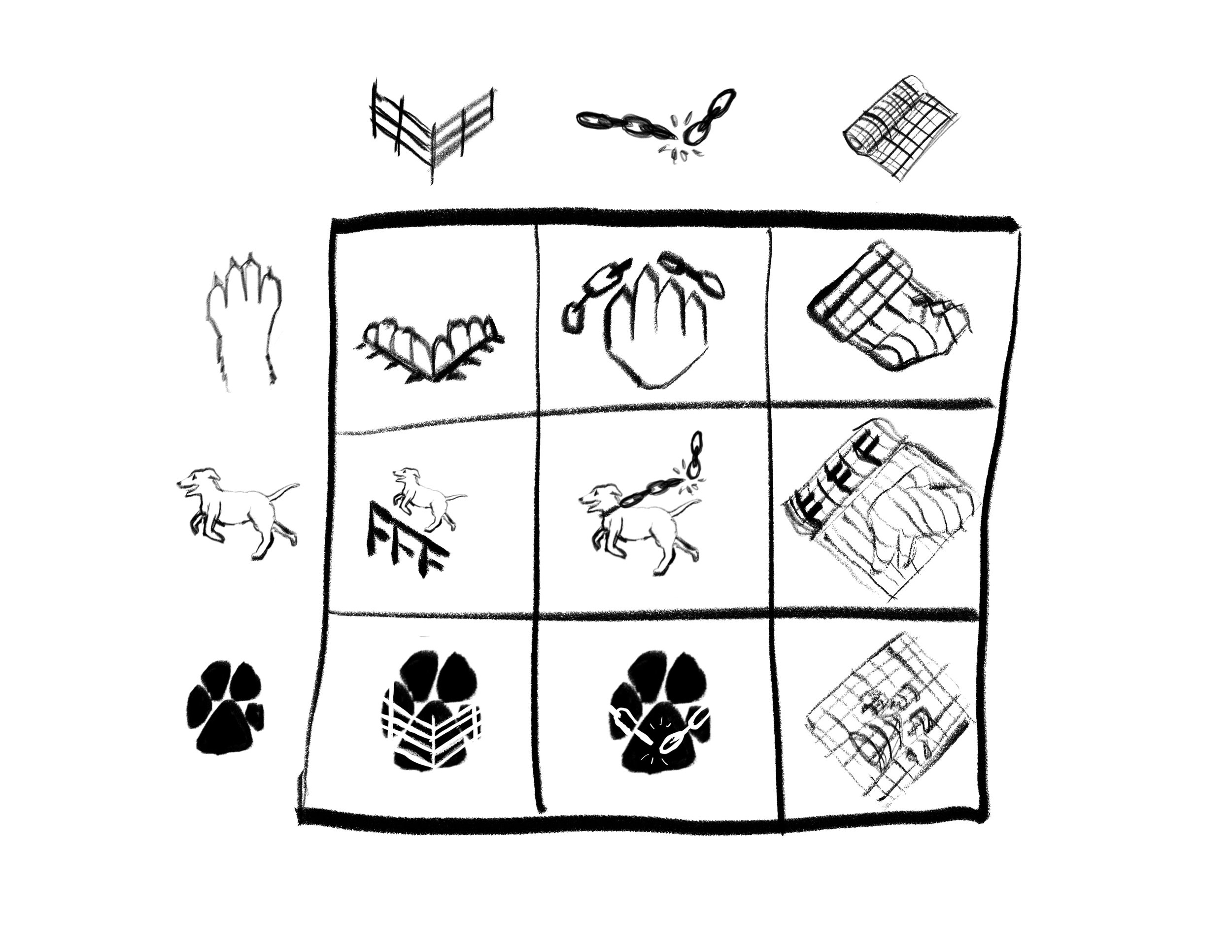
Early concepts only the mother designer could love:

Getting warmer…

There!

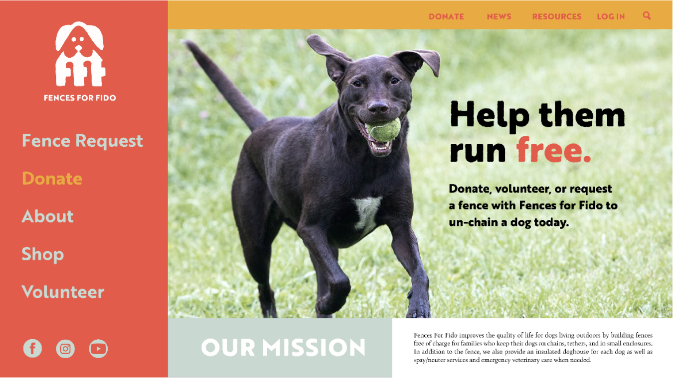
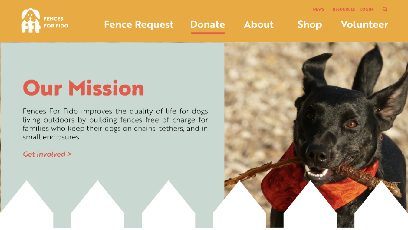
Website Redesign

Original

Updated
But how?
The biggest revelation from user-testing was that folks didn’t know what the FFF mission was.


They also had trouble navigating during testing, so I optimized the page options.
Moodboard + Initial Pages
(I was developing the logo in tandem, hence the sad placeholder)